
Services
Art Direction
Campaign Design
Web Design
Mobile App Design
Info
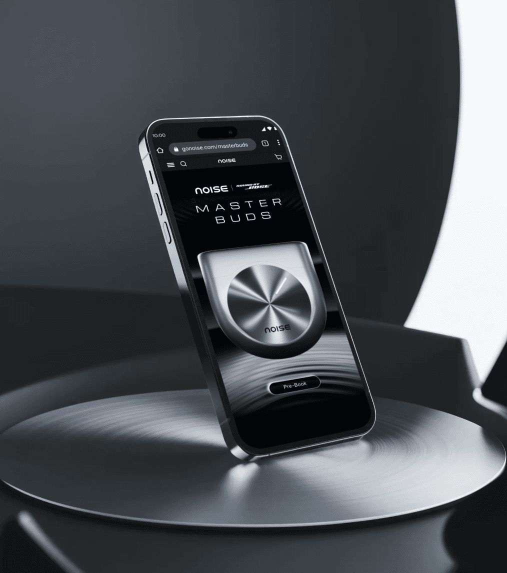
Visual campaign and product launch graphics for Noise’s first premium earbuds tuned by Bose.
Industry
Consumer Electronics
Consumer Electronics
Year
2024
2024
Services
Art Direction
Campaign Design
Web Design
Mobile App Design
Info
Visual campaign and product launch graphics for Noise’s first premium earbuds tuned by Bose.
Launching Noise’s first earbuds tuned by Bose.
Launching Noise’s first earbuds tuned by Bose.
Launching Noise’s first earbuds tuned by Bose.
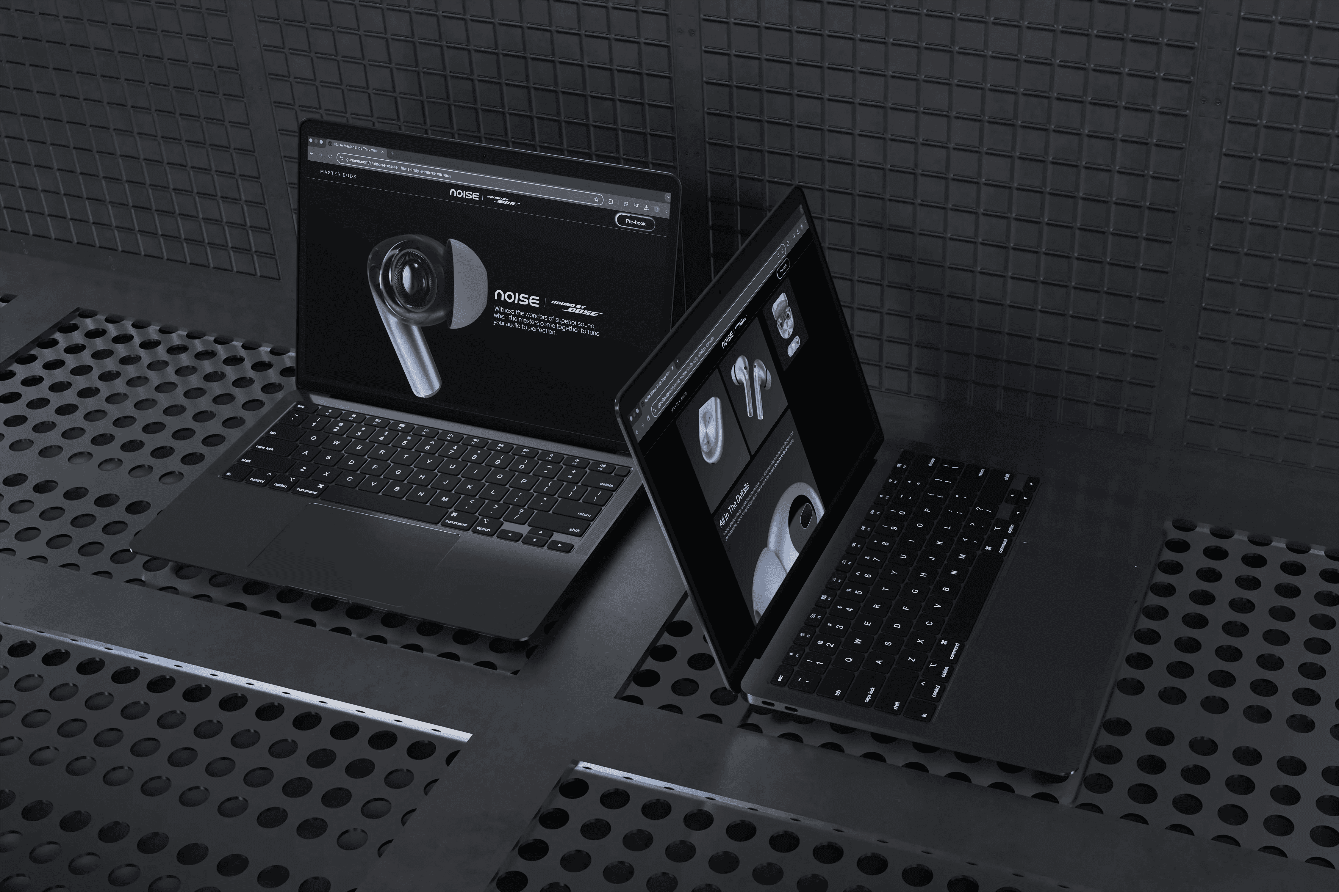
Master Buds were Noise’s big premium move and its first collaboration with Bose. We designed the launch: campaign visuals, the pre-order website and the product storytelling around it.
Master Buds were Noise’s big premium move and its first collaboration with Bose. We designed the launch: campaign visuals, the pre-order website and the product storytelling around it.
Master Buds were Noise’s big premium move and its first collaboration with Bose. We designed the launch: campaign visuals, the pre-order website and the product storytelling around it.

The brief
The brief
The brief
Noise is known for bold, accessible wearables. Master Buds were meant to change how people saw the brand: a premium product, tuned by Bose, with a premium price.
Noise is known for bold, accessible wearables. Master Buds were meant to change how people saw the brand: a premium product, tuned by Bose, with a premium price.
Noise is known for bold, accessible wearables. Master Buds were meant to change how people saw the brand: a premium product, tuned by Bose, with a premium price.
The brief was a launch that looked and felt as premium as the earbuds, across campaign graphics, the website and app screens.
The brief was a launch that looked and felt as premium as the earbuds, across campaign graphics, the website and app screens.
The brief was a launch that looked and felt as premium as the earbuds, across campaign graphics, the website and app screens.
The challenge
The challenge
The challenge
A premium price needs a premium first impression. The product had to stay at the centre of every frame, and the Bose partnership had to read instantly.
A premium price needs a premium first impression. The product had to stay at the centre of every frame, and the Bose partnership had to read instantly.
A premium price needs a premium first impression. The product had to stay at the centre of every frame, and the Bose partnership had to read instantly.
On top of that, the technical story of drivers, battery life and build quality had to feel exciting, not like a spec sheet.
On top of that, the technical story of drivers, battery life and build quality had to feel exciting, not like a spec sheet.
On top of that, the technical story of drivers, battery life and build quality had to feel exciting, not like a spec sheet.
Our approach
Our approach
Our approach
We let the product lead, and built every piece of the launch around showing it off.
We let the product lead, and built every piece of the launch around showing it off.
We let the product lead, and built every piece of the launch around showing it off.
A teaser that sets the tone
A teaser that sets the tone
A teaser that sets the tone
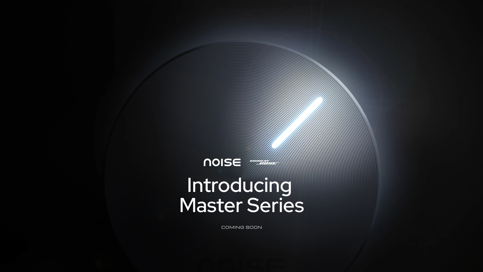
The “Introducing Master Series” teaser and launch motion announced the Noise × Bose partnership in dark, high-contrast frames, with the earbuds centre stage.
The “Introducing Master Series” teaser and launch motion announced the Noise × Bose partnership in dark, high-contrast frames, with the earbuds centre stage.
The “Introducing Master Series” teaser and launch motion announced the Noise × Bose partnership in dark, high-contrast frames, with the earbuds centre stage.
Product-first visuals
Product-first visuals
Product-first visuals
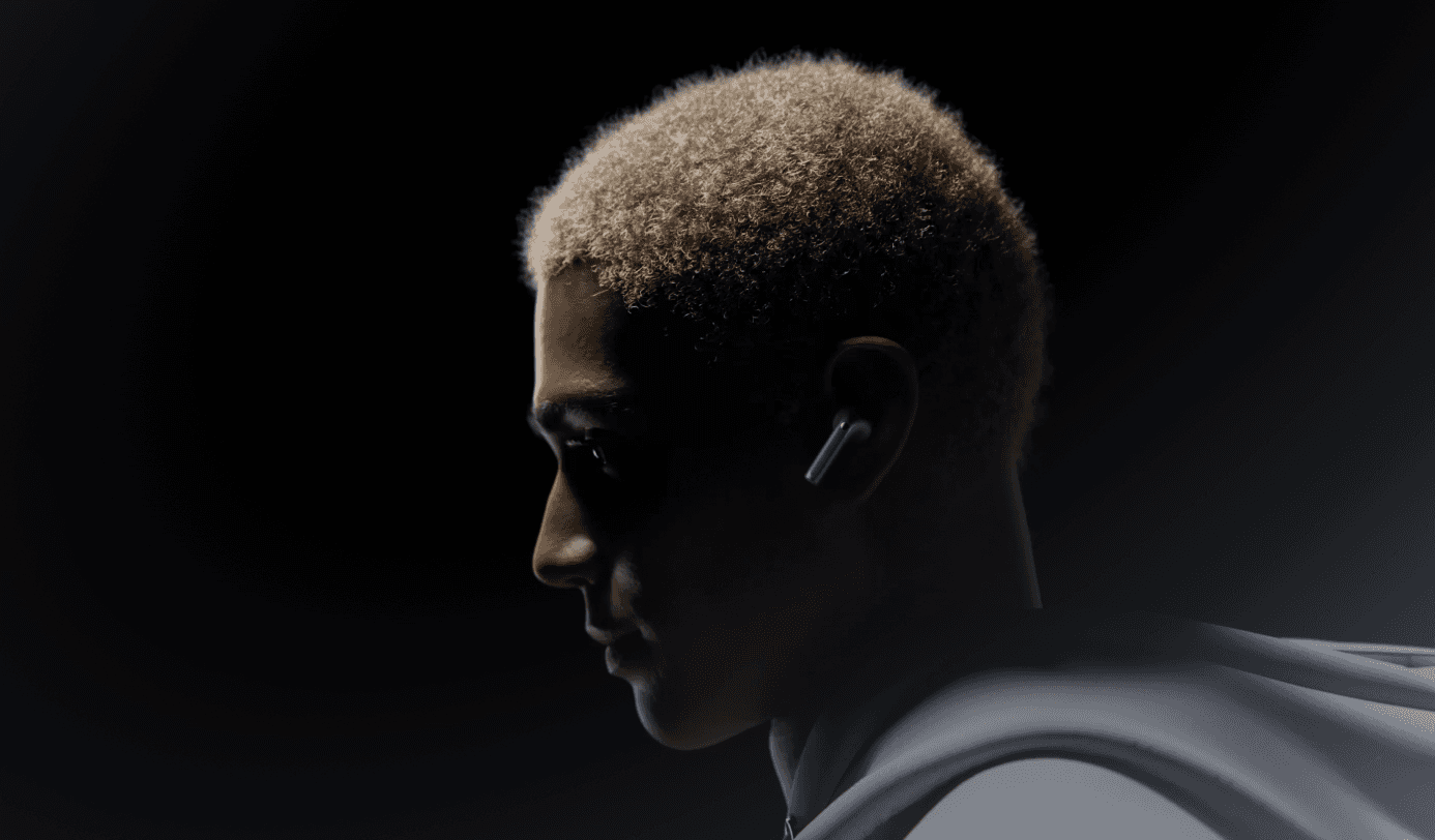
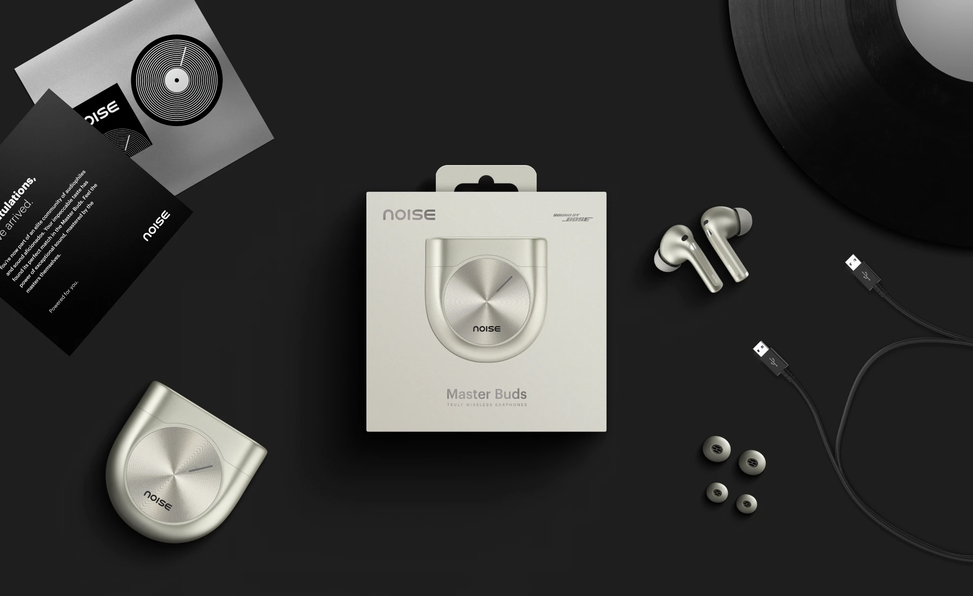
Moody studio lighting and close, art-directed frames made the earbuds feel like a premium object rather than a gadget.
Moody studio lighting and close, art-directed frames made the earbuds feel like a premium object rather than a gadget.
Moody studio lighting and close, art-directed frames made the earbuds feel like a premium object rather than a gadget.
A footer worth scrolling to
A footer worth scrolling to
A footer worth scrolling to
The website footer became a place to show off the build quality. 3D scans and exploded views reward the people who care enough to scroll to the very end.
The website footer became a place to show off the build quality. 3D scans and exploded views reward the people who care enough to scroll to the very end.
The website footer became a place to show off the build quality. 3D scans and exploded views reward the people who care enough to scroll to the very end.
Specs that feel exciting
Specs that feel exciting
Specs that feel exciting
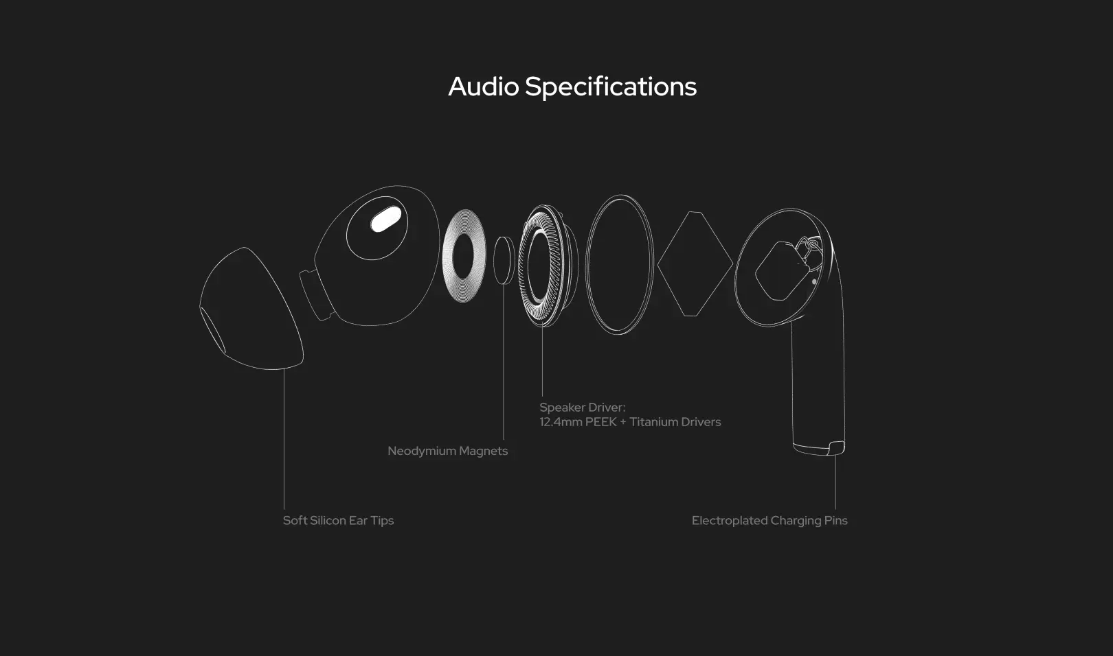
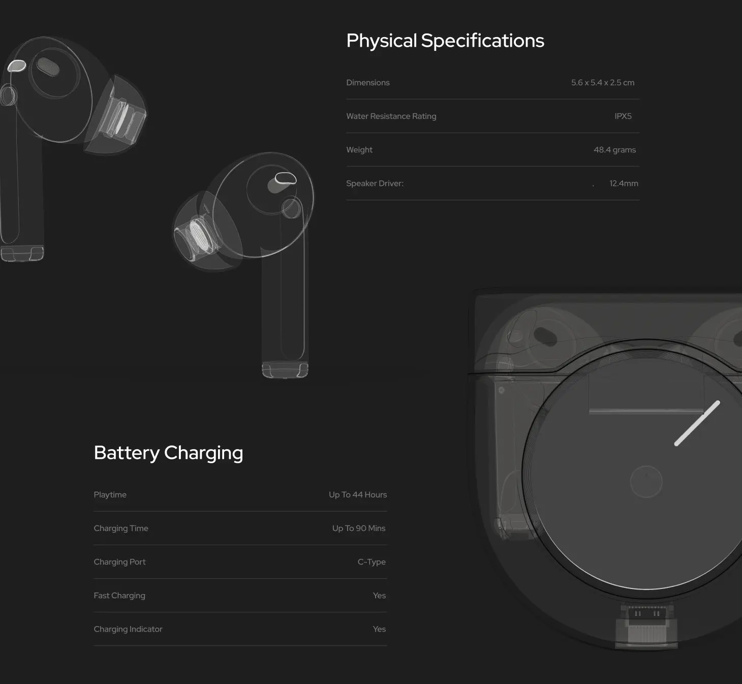
Exploded diagrams and X-ray style renders turned drivers, battery life and dimensions into sections people actually want to look at.
Exploded diagrams and X-ray style renders turned drivers, battery life and dimensions into sections people actually want to look at.
Exploded diagrams and X-ray style renders turned drivers, battery life and dimensions into sections people actually want to look at.
Have a project like this?
Have a project like this?
Have a project like this?
Tell us what you’re building on a quick call.
Tell us what you’re building on a quick call.
Tell us what you’re building on a quick call.
Next project
Next project
Next project
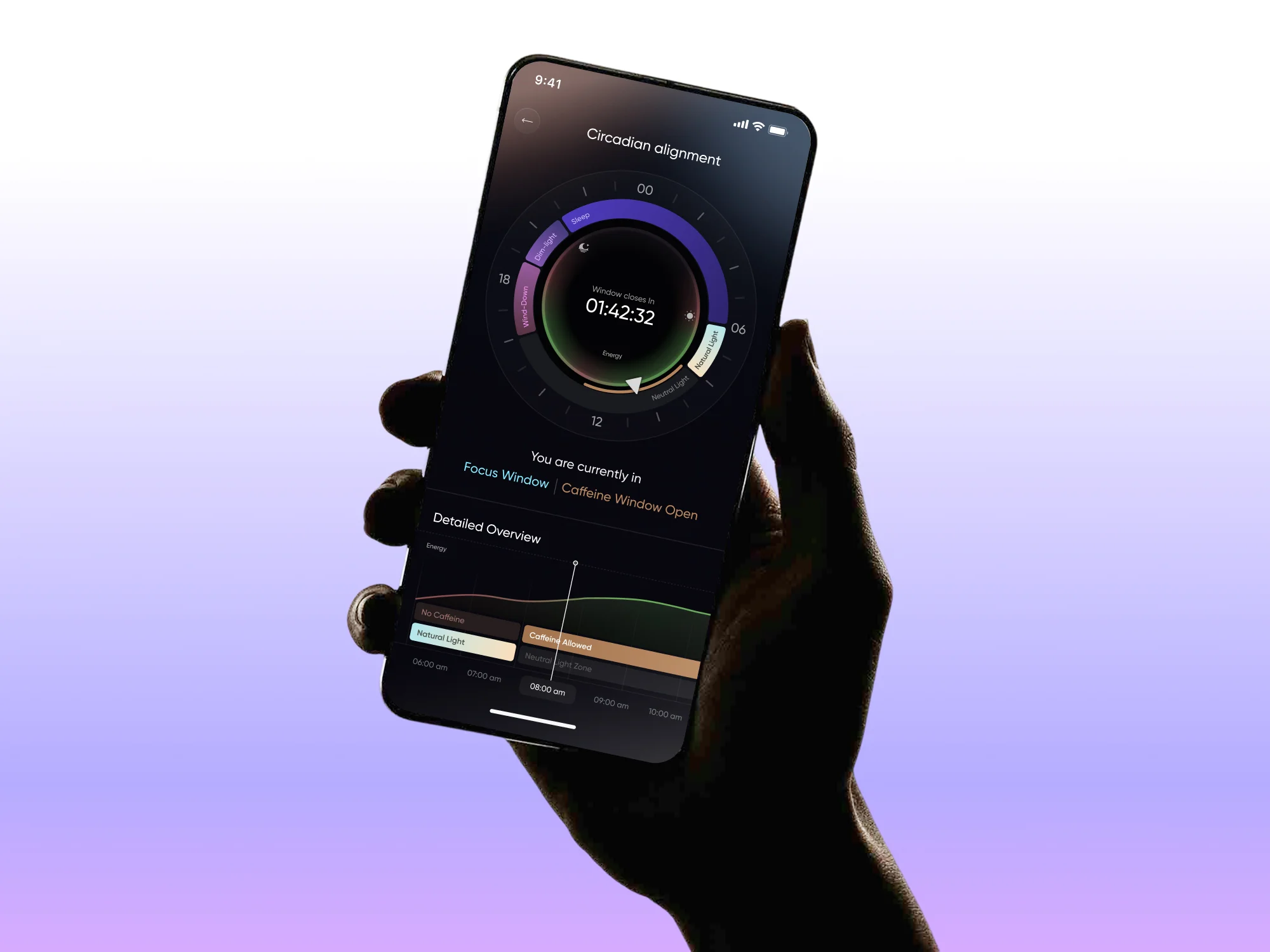
Luna Ring: a feature that turns body-clock data into a daily plan.
Check out similar projects!
More
Switch ON the