
Services
Art Direction
Web Design
Campaign Design
Product Design
Info
Launch campaign visuals designed for the Airwave Max 6 headphones.
Industry
Consumer Electronics
Consumer Electronics
Year
2025
2025
Services
Art Direction
Web Design
Campaign Design
Product Design
Info
Launch campaign visuals designed for the Airwave Max 6 headphones.
A headphone launch that dresses like fashion.
A headphone launch that dresses like fashion.
A headphone launch that dresses like fashion.
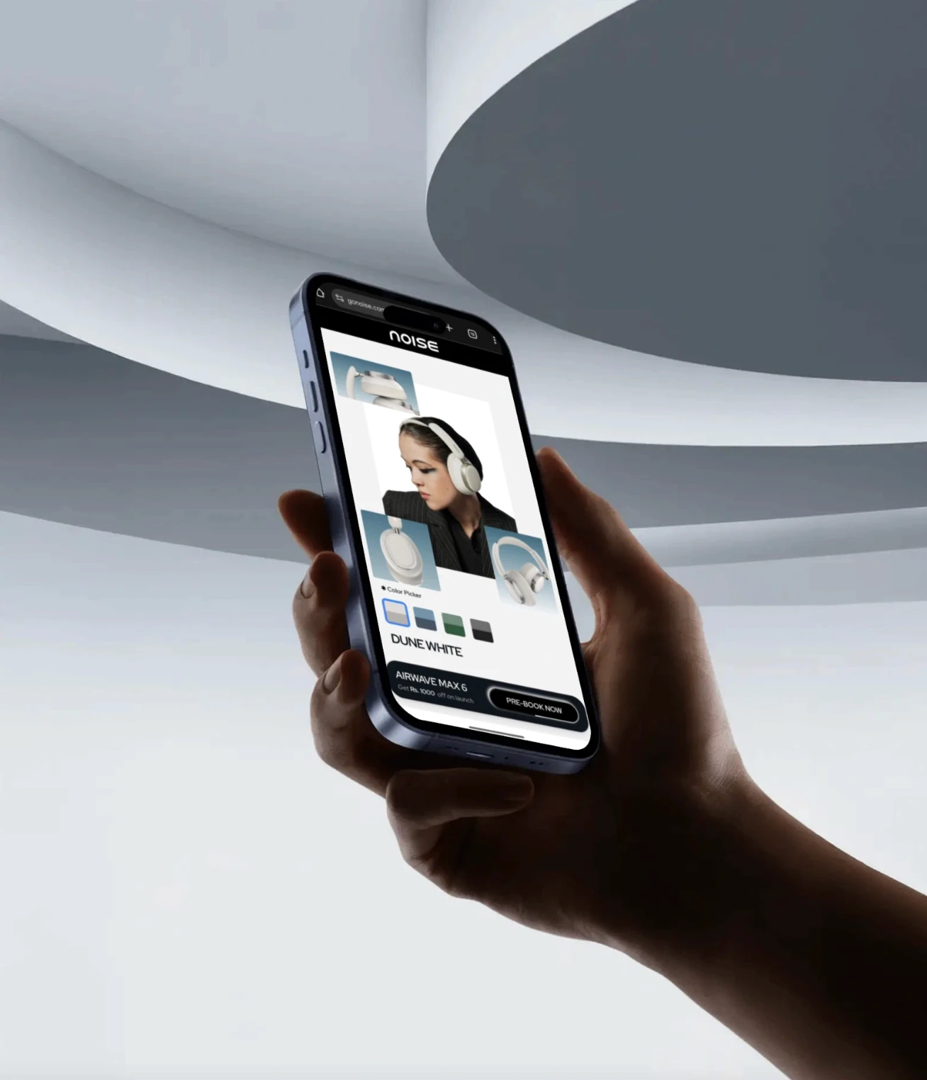
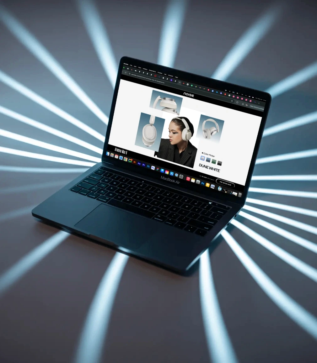
Airwave Max 6 are Noise’s over-ear headphones. We designed the launch: the website, campaign visuals, typography and out-of-home, with motion running through all of it.
Airwave Max 6 are Noise’s over-ear headphones. We designed the launch: the website, campaign visuals, typography and out-of-home, with motion running through all of it.
Airwave Max 6 are Noise’s over-ear headphones. We designed the launch: the website, campaign visuals, typography and out-of-home, with motion running through all of it.
The brief
The brief
The brief
Noise needed a launch for Airwave Max 6 that felt as big as the sound.
Noise needed a launch for Airwave Max 6 that felt as big as the sound.
Noise needed a launch for Airwave Max 6 that felt as big as the sound.
The brief covered the campaign look, a product website that works on mobile and desktop, and visuals for social and out-of-home.
The brief covered the campaign look, a product website that works on mobile and desktop, and visuals for social and out-of-home.
The brief covered the campaign look, a product website that works on mobile and desktop, and visuals for social and out-of-home.
The challenge
The challenge
The challenge
The headphones were made for people who care about high-end audio but are fashion-first. The launch had to sell sound quality without looking like a spec sheet.
The headphones were made for people who care about high-end audio but are fashion-first. The launch had to sell sound quality without looking like a spec sheet.
The headphones were made for people who care about high-end audio but are fashion-first. The launch had to sell sound quality without looking like a spec sheet.
It needed to feel at home next to a fashion campaign, not a gadget ad.
It needed to feel at home next to a fashion campaign, not a gadget ad.
It needed to feel at home next to a fashion campaign, not a gadget ad.
Our approach
Our approach
Our approach
We treated the headphones like a fashion piece, and let the campaign carry the tech story.
We treated the headphones like a fashion piece, and let the campaign carry the tech story.
We treated the headphones like a fashion piece, and let the campaign carry the tech story.
Type with a fashion edge
Type with a fashion edge
Type with a fashion edge
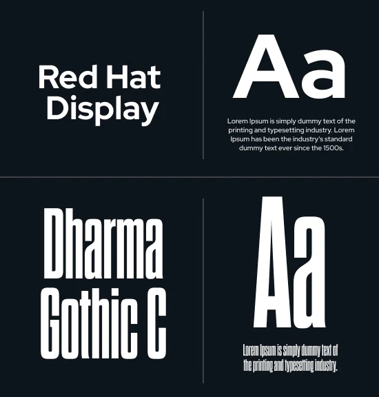
Dharma Gothic C, tall and condensed, gives headlines the feel of a fashion campaign, while Red Hat Display keeps the rest clean and readable. A colour-change animation shows off every finish.
Dharma Gothic C, tall and condensed, gives headlines the feel of a fashion campaign, while Red Hat Display keeps the rest clean and readable. A colour-change animation shows off every finish.
Dharma Gothic C, tall and condensed, gives headlines the feel of a fashion campaign, while Red Hat Display keeps the rest clean and readable. A colour-change animation shows off every finish.
A website built for both screens
A website built for both screens
A website built for both screens
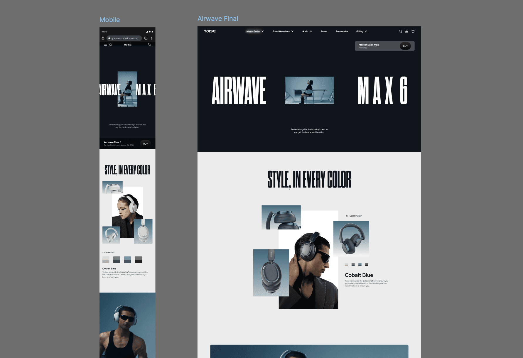
One product page designed for mobile and desktop side by side, with a colour picker for every finish and the headphones always front and centre.
One product page designed for mobile and desktop side by side, with a colour picker for every finish and the headphones always front and centre.
One product page designed for mobile and desktop side by side, with a colour picker for every finish and the headphones always front and centre.
Campaign visuals that sell the build
Campaign visuals that sell the build
Campaign visuals that sell the build
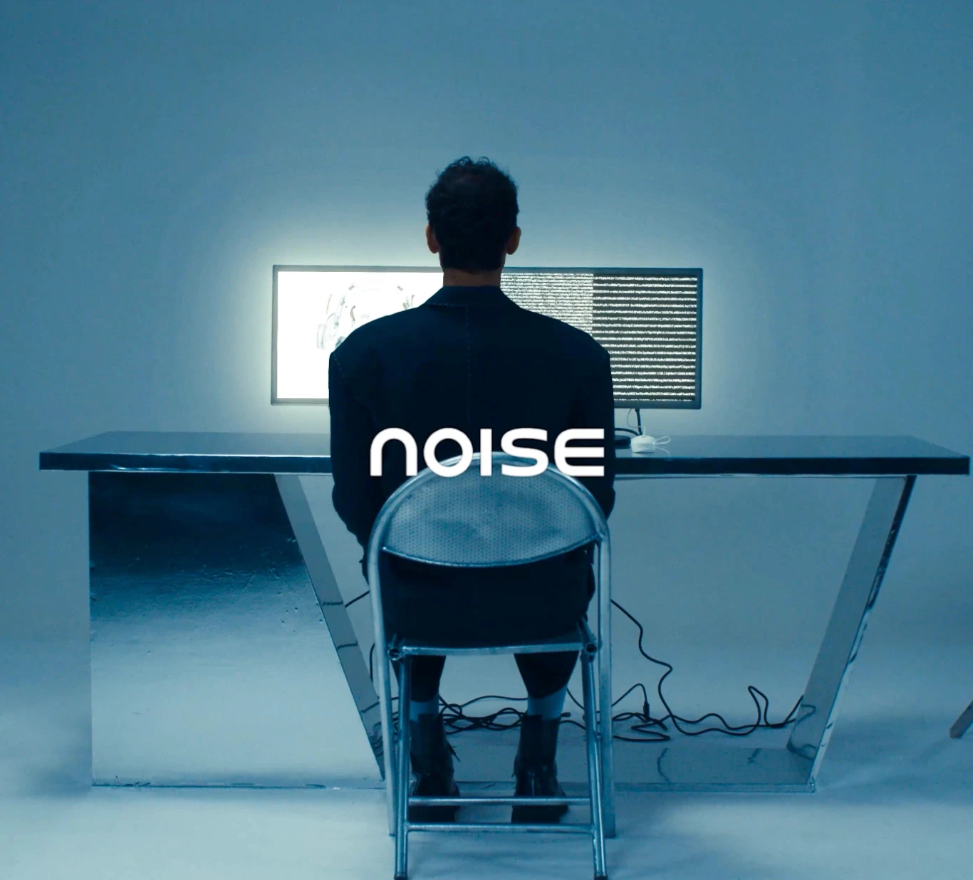
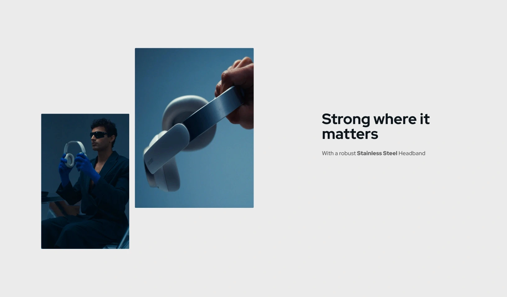
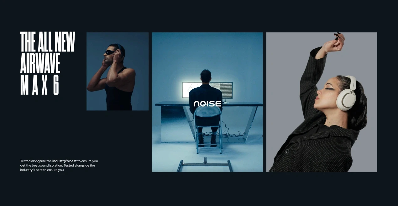
Moody, blue-toned campaign imagery and layouts like “Strong where it matters” put details such as the stainless steel headband front and centre.
Moody, blue-toned campaign imagery and layouts like “Strong where it matters” put details such as the stainless steel headband front and centre.
Moody, blue-toned campaign imagery and layouts like “Strong where it matters” put details such as the stainless steel headband front and centre.
Out in the world
Out in the world
Out in the world
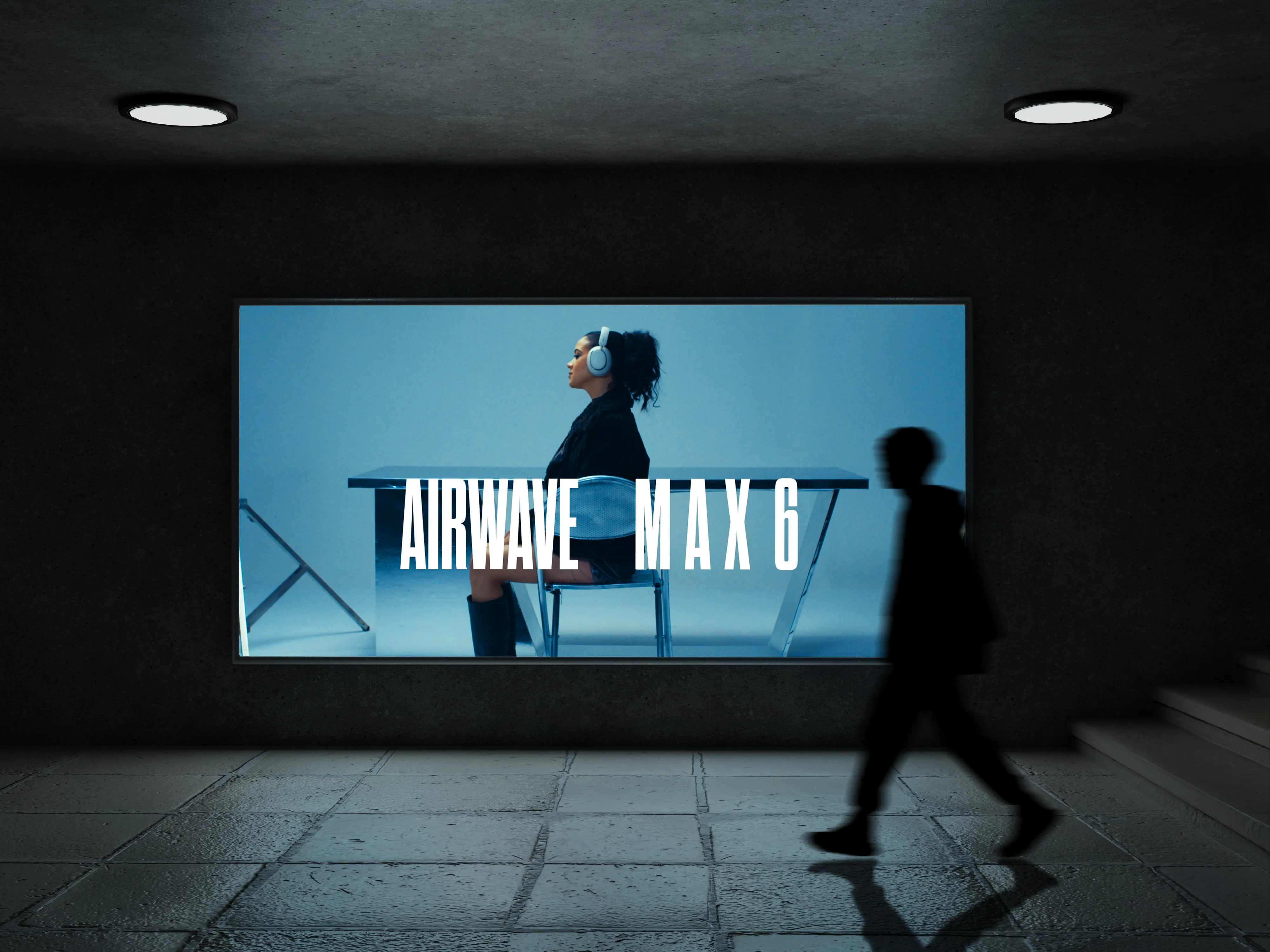
The same look runs onto a subway LED billboard and into motion, so the launch feels like one story wherever people see it.
The same look runs onto a subway LED billboard and into motion, so the launch feels like one story wherever people see it.
The same look runs onto a subway LED billboard and into motion, so the launch feels like one story wherever people see it.
Have a project like this?
Have a project like this?
Have a project like this?
Tell us what you’re building on a quick call.
Tell us what you’re building on a quick call.
Tell us what you’re building on a quick call.
Next project
Next project
Next project
Royale Icon: a dress-watch brand and launch renders for pebble’s luxury smartwatch.

Check out similar projects!
More
Switch ON the