Services
Branding
Art Direction
App Design
Apparel Design
Info
Identity design for a streetwear brand that refuses to be subtle.
Industry
Fashion / Apparel
Year
2024
2024
Services
Branding
Art Direction
App Design
Apparel Design
Info
Identity design for a streetwear brand that refuses to be subtle.
A streetwear label drawn entirely by hand.
A streetwear label drawn entirely by hand.
A streetwear label drawn entirely by hand.
MegaGiant is a gaming and anime-inspired streetwear label. We built its identity, drew every T-shirt graphic from scratch, and designed the packaging, Instagram and shopping app around them.
MegaGiant is a gaming and anime-inspired streetwear label. We built its identity, drew every T-shirt graphic from scratch, and designed the packaging, Instagram and shopping app around them.
MegaGiant is a gaming and anime-inspired streetwear label. We built its identity, drew every T-shirt graphic from scratch, and designed the packaging, Instagram and shopping app around them.
The brief
The brief
The brief
MegaGiant wanted to show up loud: streetwear for people who grew up on games, anime and pop culture.
MegaGiant wanted to show up loud: streetwear for people who grew up on games, anime and pop culture.
MegaGiant wanted to show up loud: streetwear for people who grew up on games, anime and pop culture.
The brief covered the whole brand: logo, apparel graphics, packaging, social and a shopping app.
The brief covered the whole brand: logo, apparel graphics, packaging, social and a shopping app.
The brief covered the whole brand: logo, apparel graphics, packaging, social and a shopping app.
The challenge
The challenge
The challenge
Streetwear is crowded, and generic graphics disappear fast. The tees had to feel personal and collectible, full of nostalgia and pop culture, while keeping an edgy streetwear attitude.
Streetwear is crowded, and generic graphics disappear fast. The tees had to feel personal and collectible, full of nostalgia and pop culture, while keeping an edgy streetwear attitude.
Streetwear is crowded, and generic graphics disappear fast. The tees had to feel personal and collectible, full of nostalgia and pop culture, while keeping an edgy streetwear attitude.
And the identity had to hold up everywhere, from a neck label to an app icon.
And the identity had to hold up everywhere, from a neck label to an app icon.
And the identity had to hold up everywhere, from a neck label to an app icon.
Our approach
Our approach
Our approach
Everything starts with the illustrations. We drew those first, then built the rest of the brand to frame them.
Everything starts with the illustrations. We drew those first, then built the rest of the brand to frame them.
Everything starts with the illustrations. We drew those first, then built the rest of the brand to frame them.
A logo built to shout
A logo built to shout
A logo built to shout
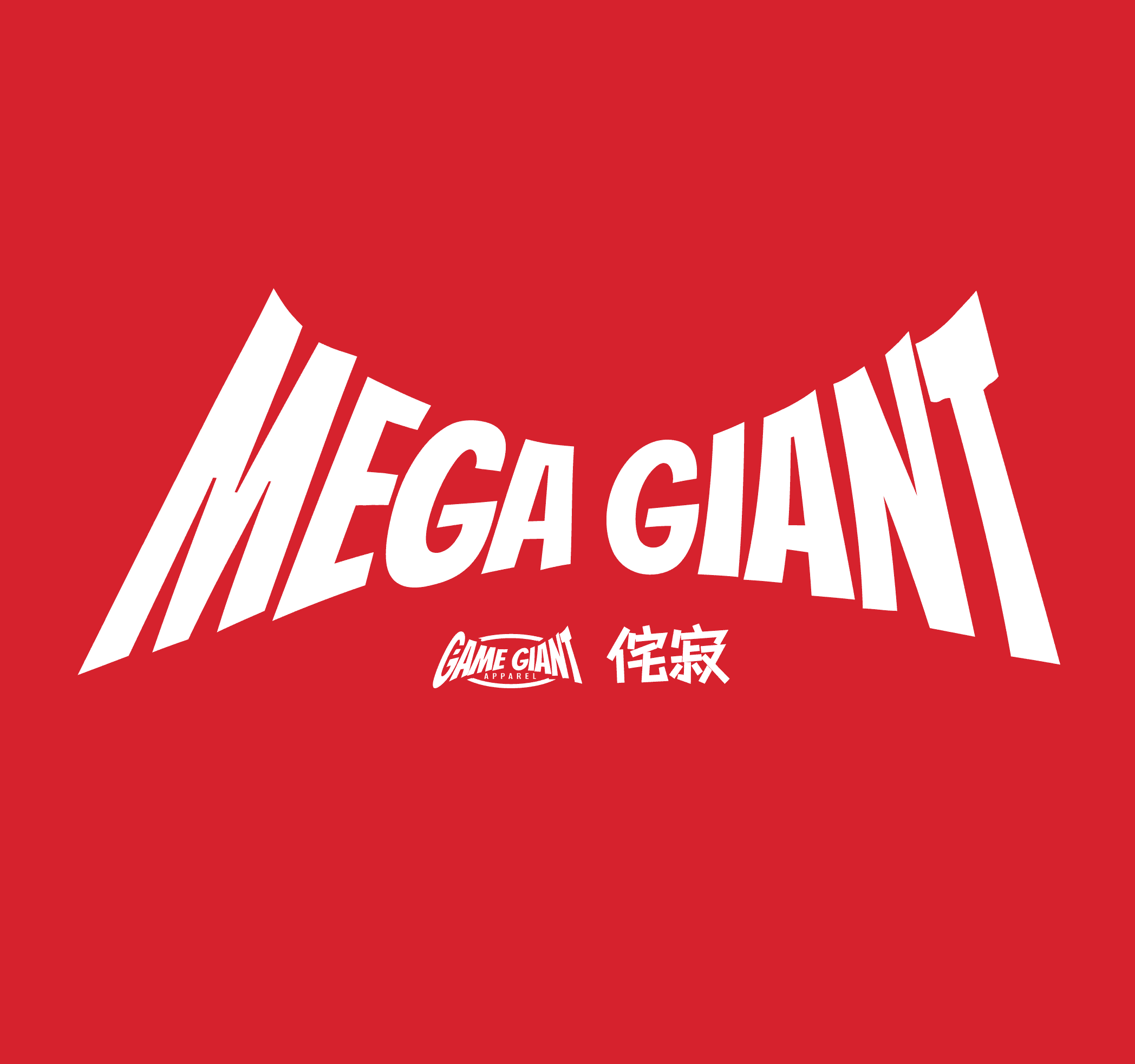
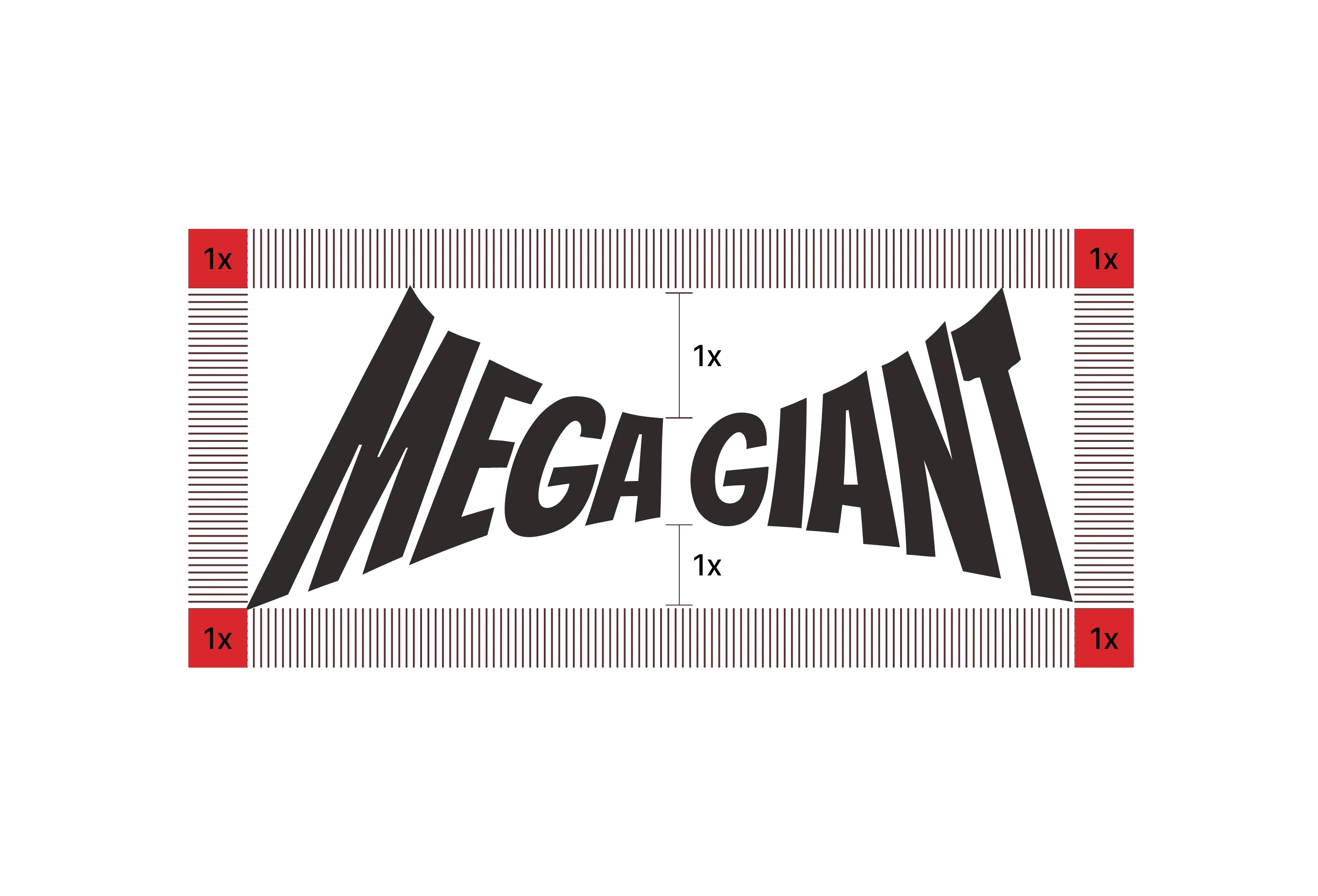
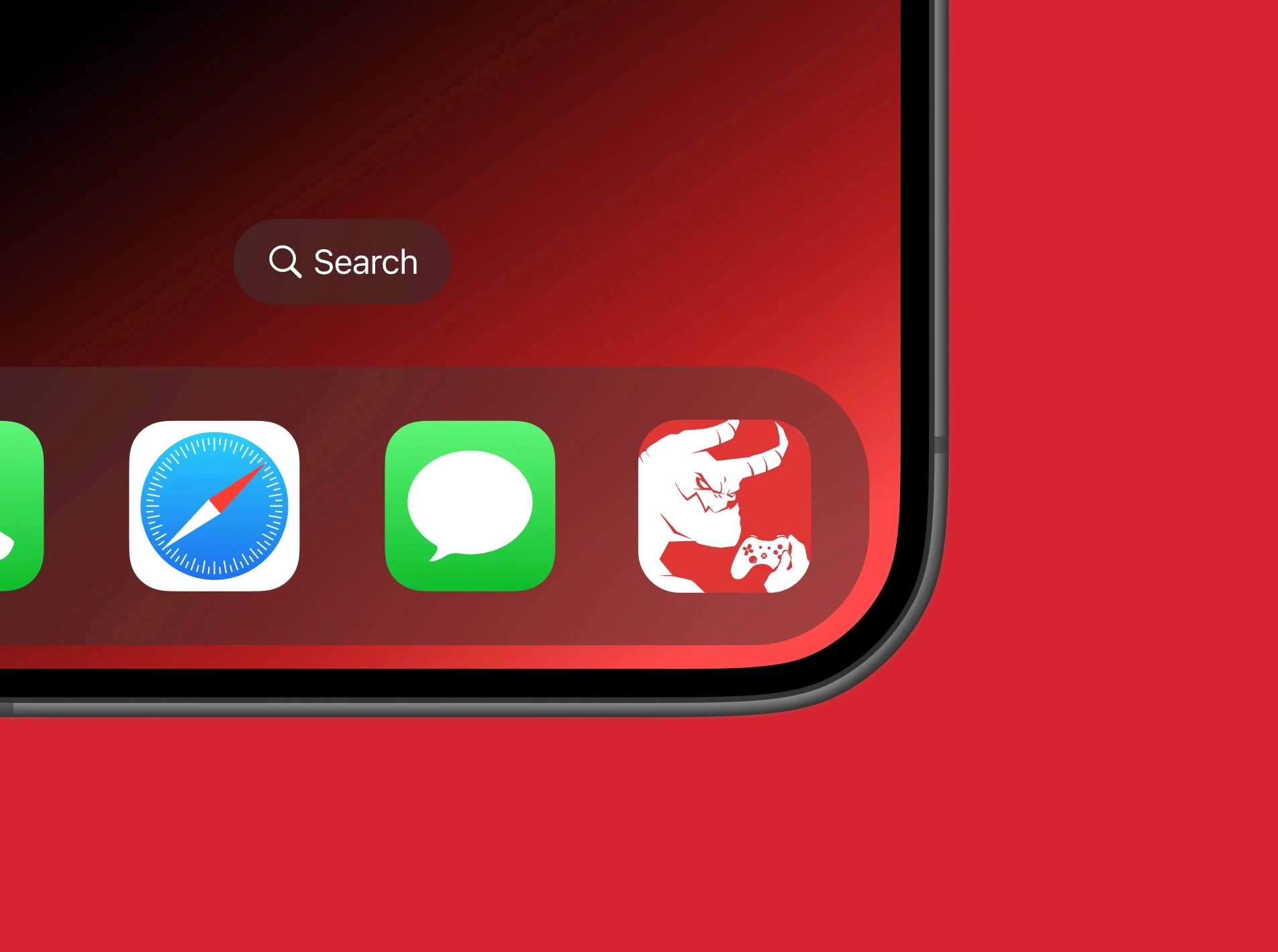
A heavy, warped wordmark with clear-space rules and a horned giant icon, built to work on labels, mailers, motion and a phone screen.
A heavy, warped wordmark with clear-space rules and a horned giant icon, built to work on labels, mailers, motion and a phone screen.
A heavy, warped wordmark with clear-space rules and a horned giant icon, built to work on labels, mailers, motion and a phone screen.
Every tee, drawn from scratch
Every tee, drawn from scratch
Every tee, drawn from scratch
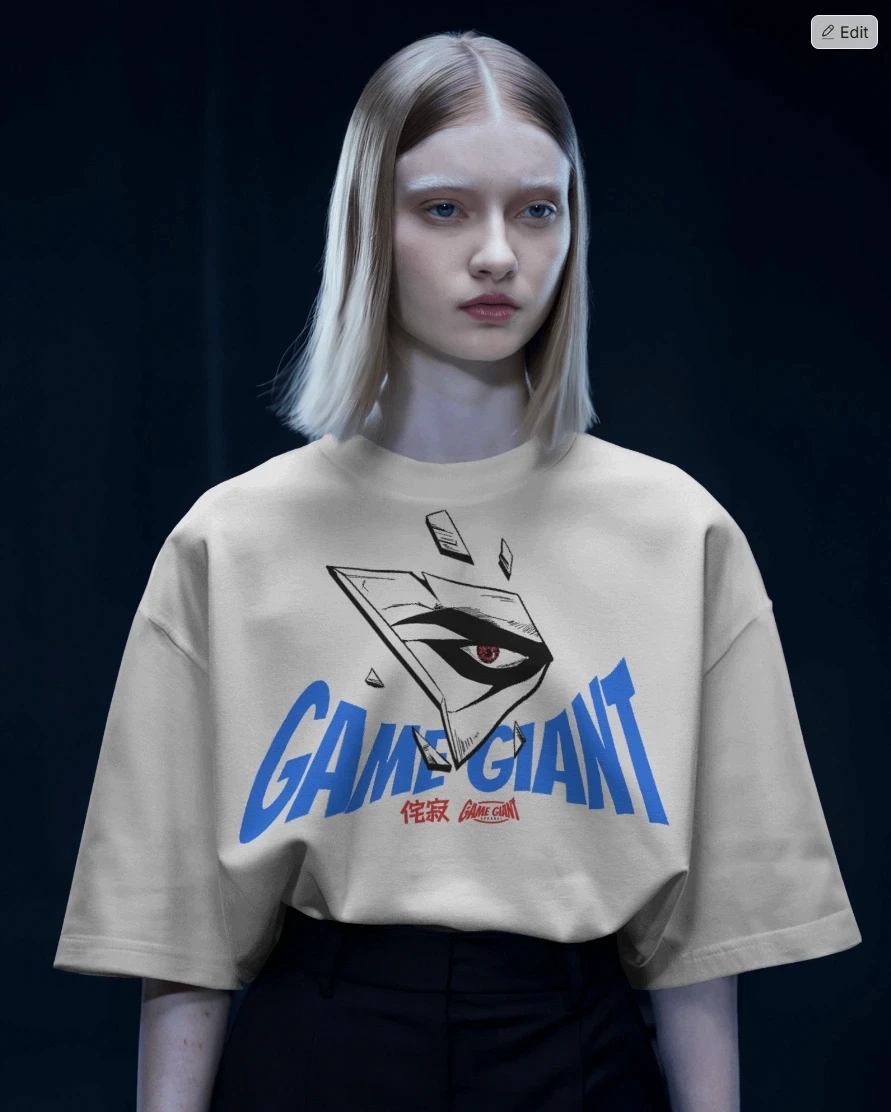
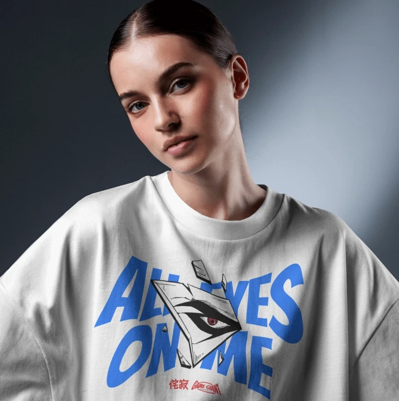
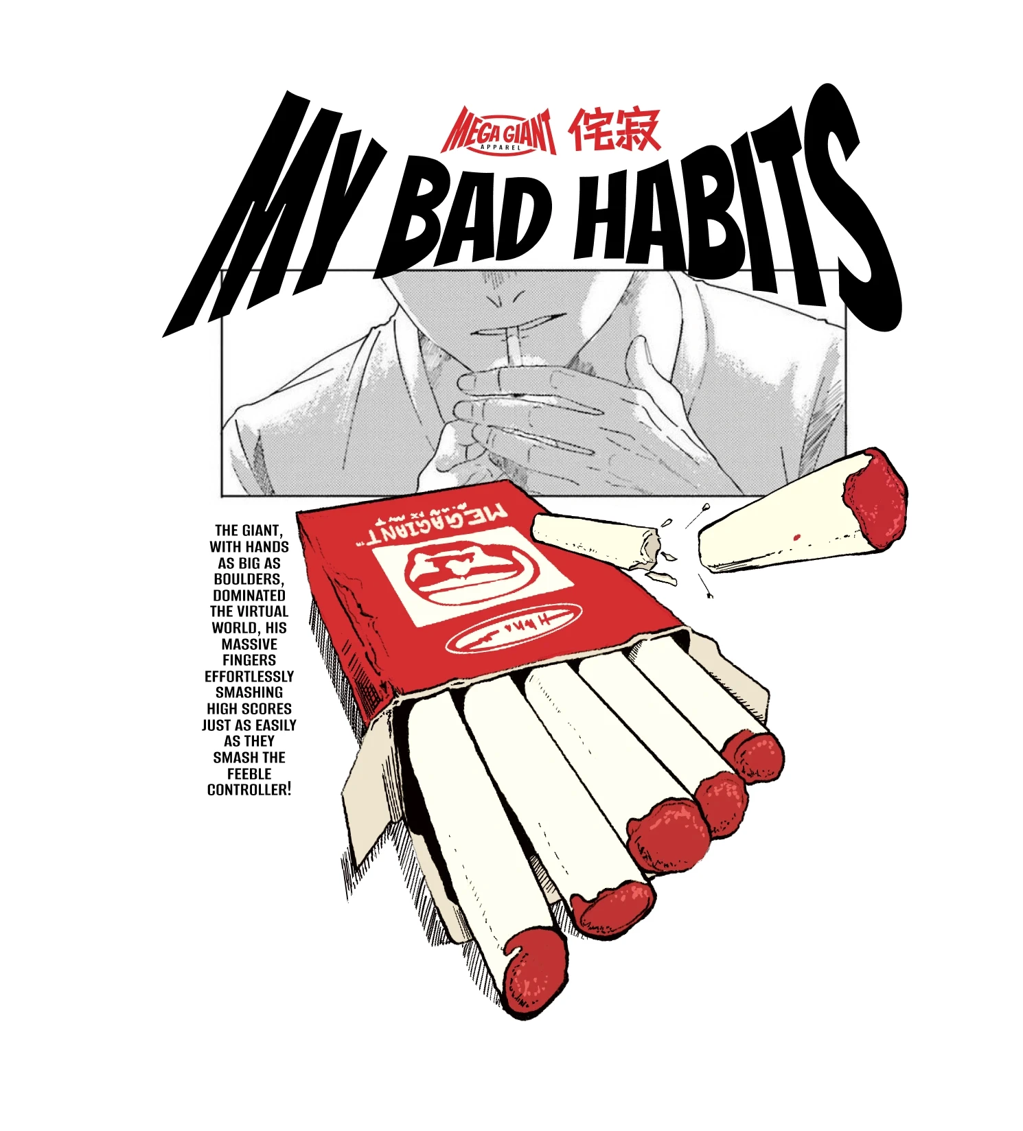
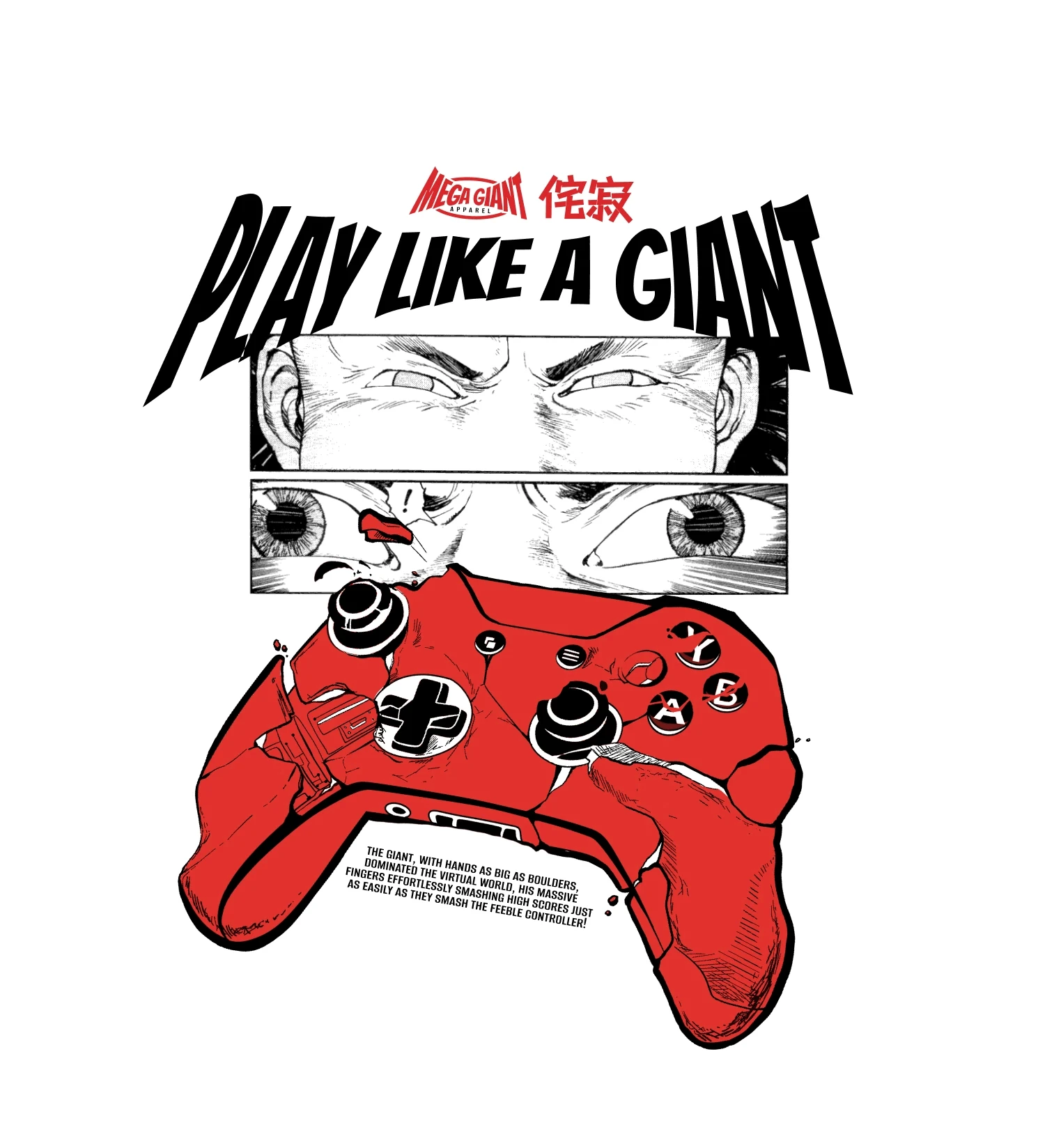
The illustrations are the heart of the brand. Every graphic was drawn by hand, mixing anime references, gaming nostalgia and a bit of attitude, so each tee feels like a piece of art rather than a print.
The illustrations are the heart of the brand. Every graphic was drawn by hand, mixing anime references, gaming nostalgia and a bit of attitude, so each tee feels like a piece of art rather than a print.
The illustrations are the heart of the brand. Every graphic was drawn by hand, mixing anime references, gaming nostalgia and a bit of attitude, so each tee feels like a piece of art rather than a print.
Packaging and social that match the tees
Packaging and social that match the tees
Packaging and social that match the tees
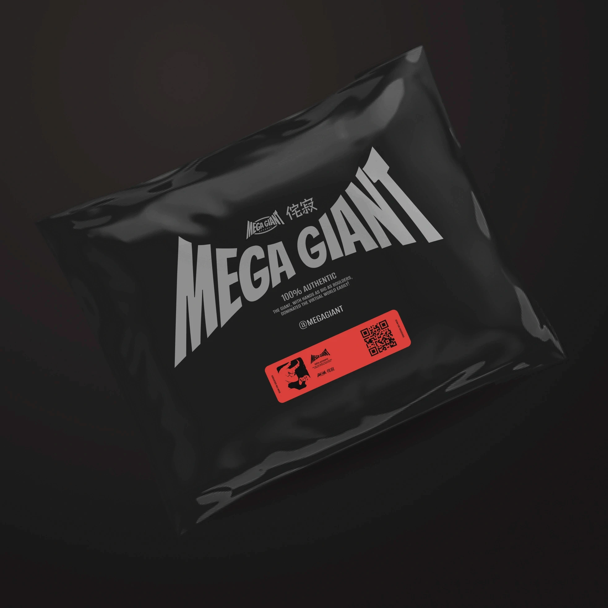
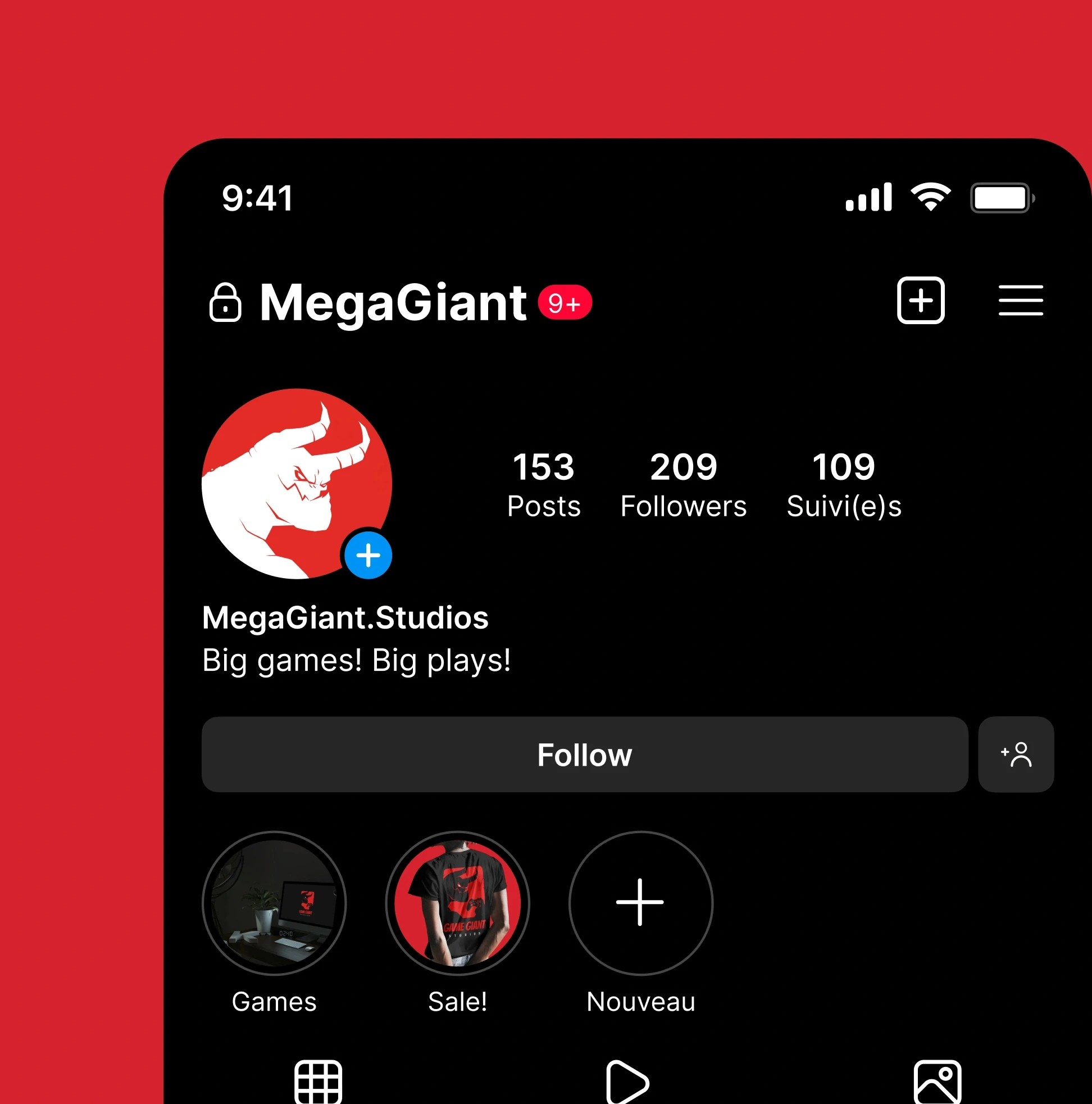
Black mailers with a red QR label, and an Instagram profile in the same loud red, so the unboxing and the feed feel like the clothes.
Black mailers with a red QR label, and an Instagram profile in the same loud red, so the unboxing and the feed feel like the clothes.
Black mailers with a red QR label, and an Instagram profile in the same loud red, so the unboxing and the feed feel like the clothes.
A shopping app that feels like the brand
A shopping app that feels like the brand
A shopping app that feels like the brand
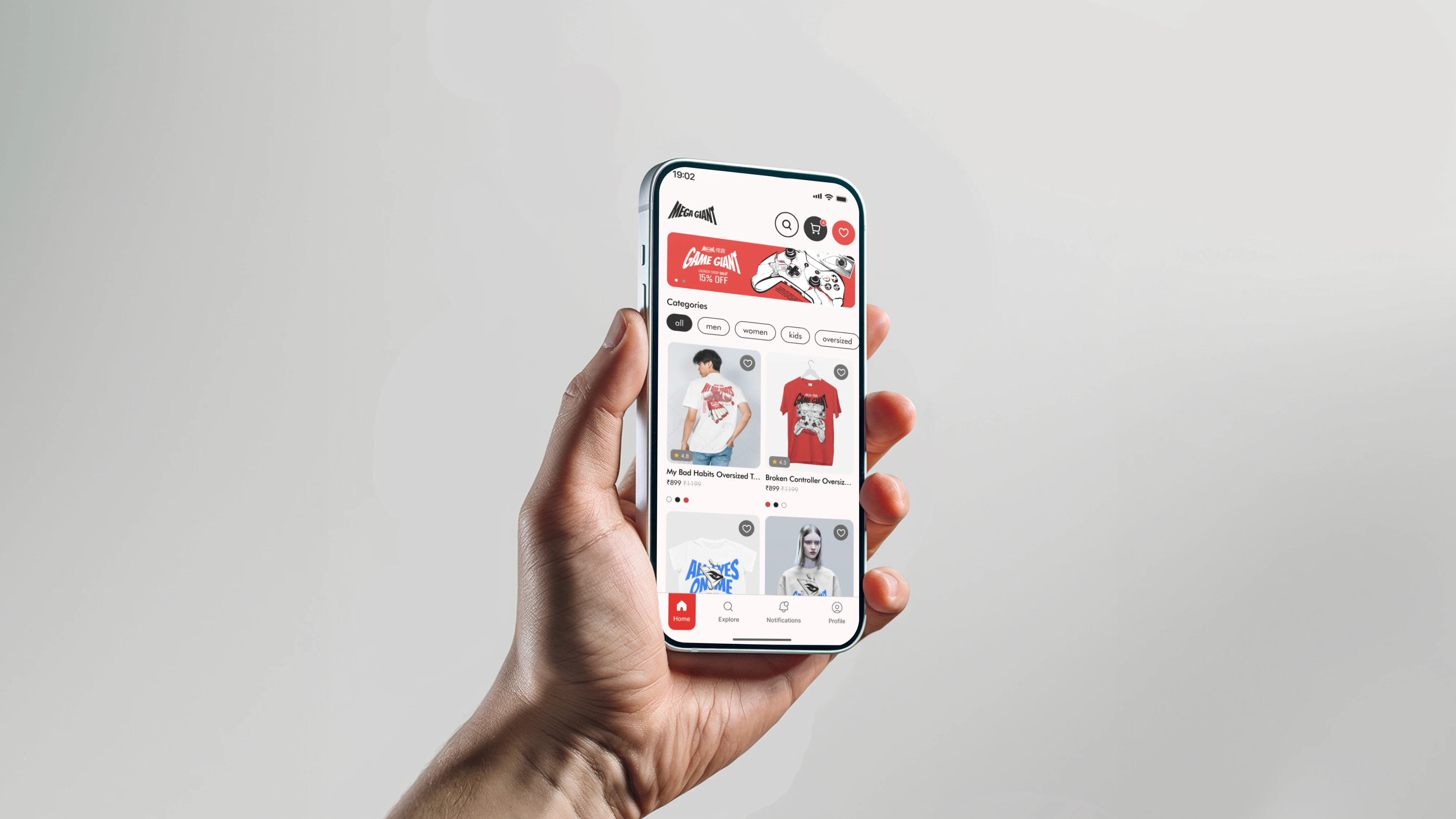
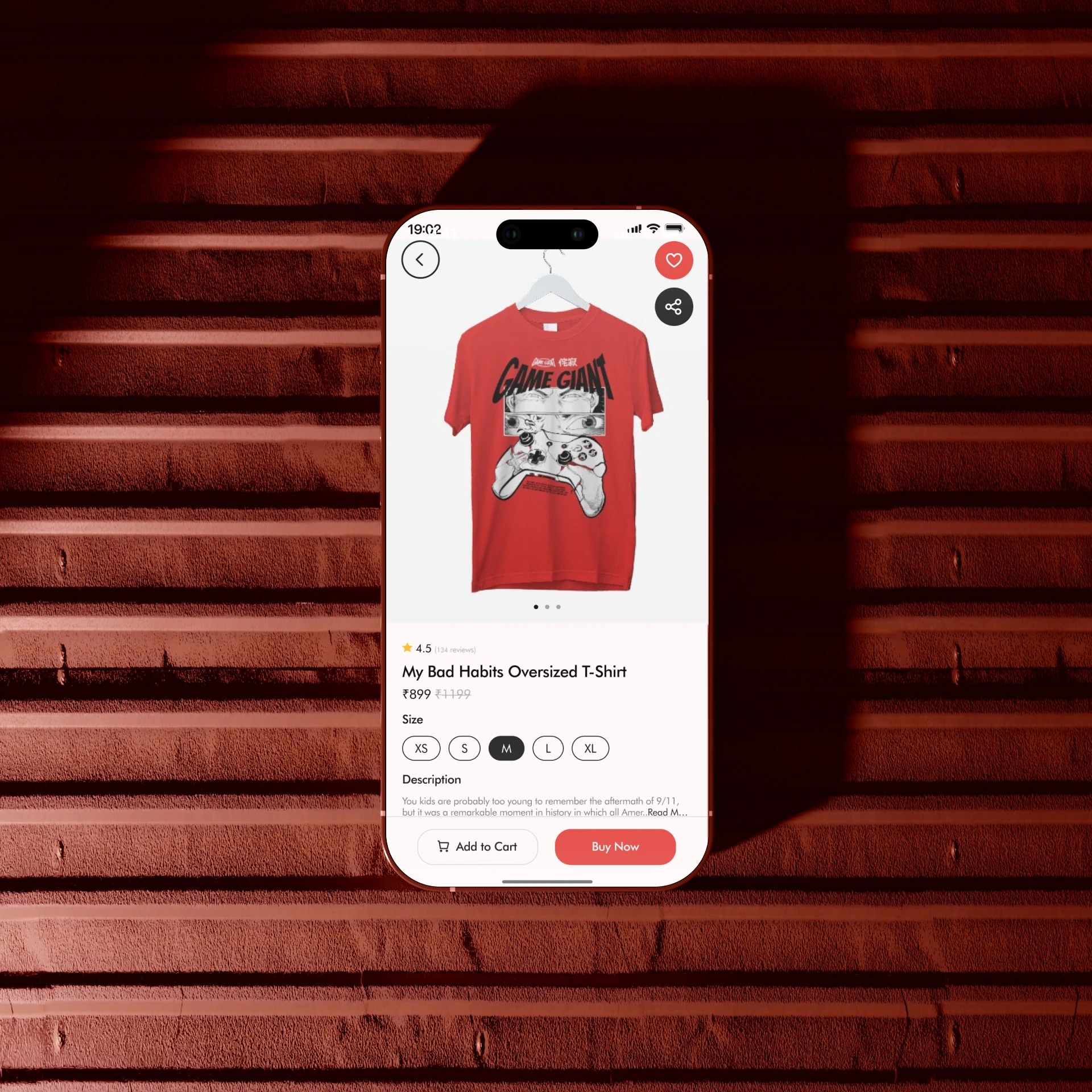
Big product imagery and bold type, so browsing the app feels like flipping through the collection.
Big product imagery and bold type, so browsing the app feels like flipping through the collection.
Big product imagery and bold type, so browsing the app feels like flipping through the collection.
Have a project like this?
Have a project like this?
Have a project like this?
Tell us what you’re building on a quick call.
Tell us what you’re building on a quick call.
Tell us what you’re building on a quick call.
Next project
Next project
Next project
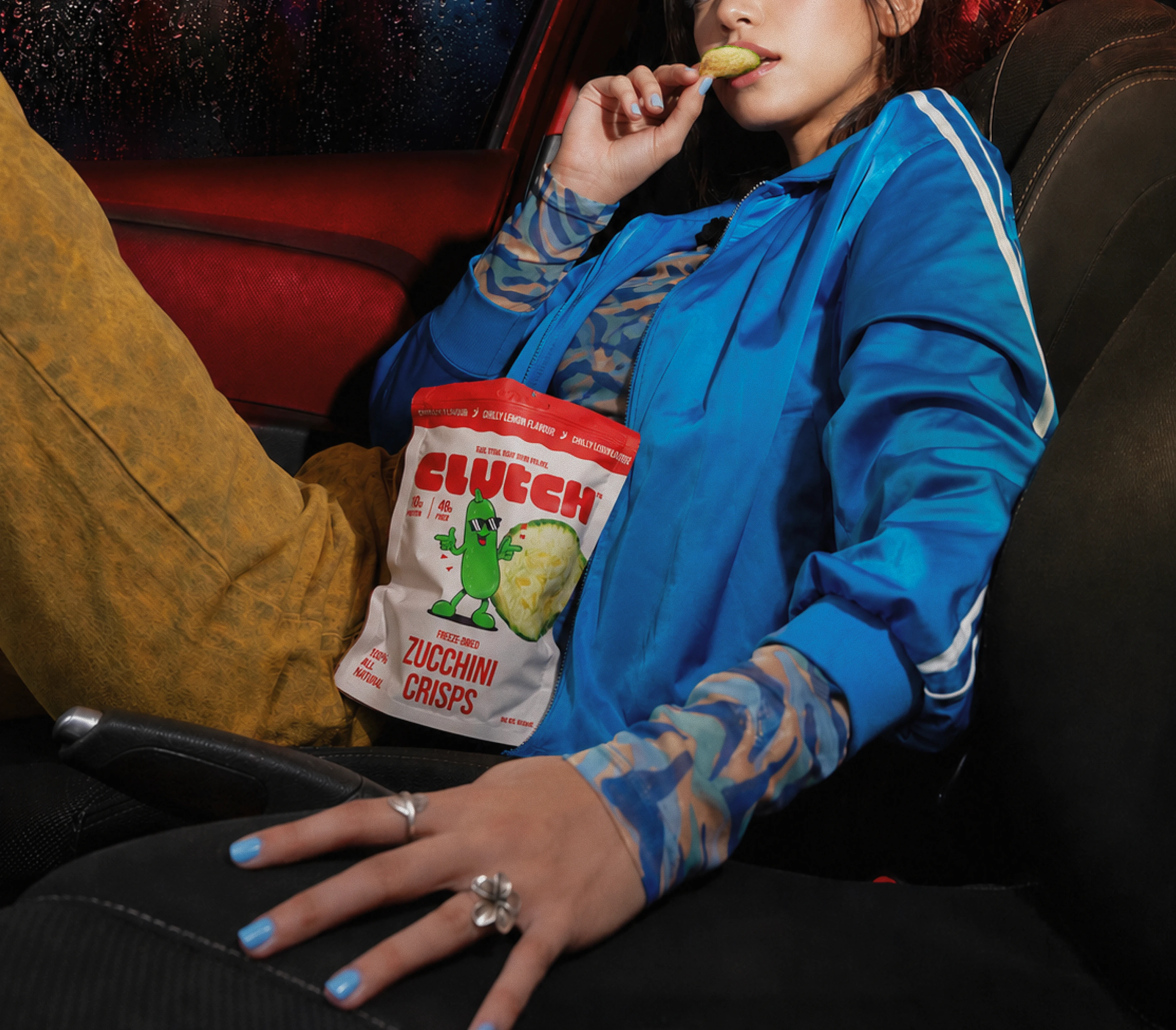
Clutch: a loud, playful brand for freeze-dried veggie crisps.
Check out similar projects!
More
Switch ON the